
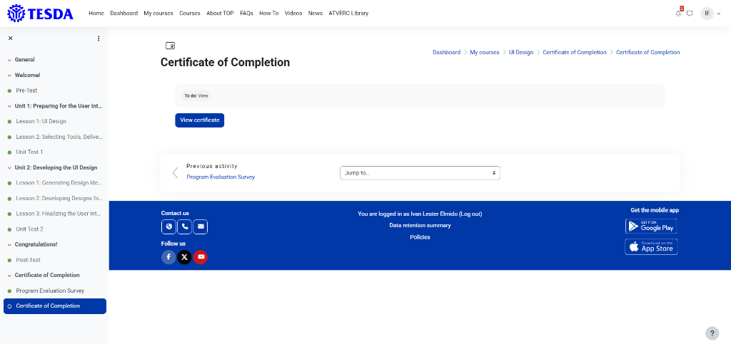
Developing Designs For User Interface.
Student
Ivan Lester Elmido
Program
BSCS (Bachelor of Science in Computer Science)
Date
September 20, 2026
Format
Web Application Showcase
01 // Course
Course Title
Developing Designs for User Interface
Visual Design
Platform
e-TESDA
02 // Proof
03 // Reflection
●
Interactive Inquiries — Click any question to reveal the full reflection
Reflection & Analysis:
The most important thing I learned is how user interface and user experience design work together. Before this, I thought UI was just about making things look pretty and colorful. Now I realize that using the right typography, shapes, colors, and negative space actually helps guide the user and makes a system feel easy to use. It taught me that design is a real tool to help people navigate software smoothly.
Reflection & Analysis:
I can use the idea of information chunking and good spacing in my dashboard projects. Sometimes screens get too crowded with lots of text and data, which can make users feel stressed. By grouping information into smaller pieces and using better layouts with clear contrast, I can make the screens much cleaner and easier for people to read and use every day.
04 // Application
01. Identified UI Problems
What can be improved?
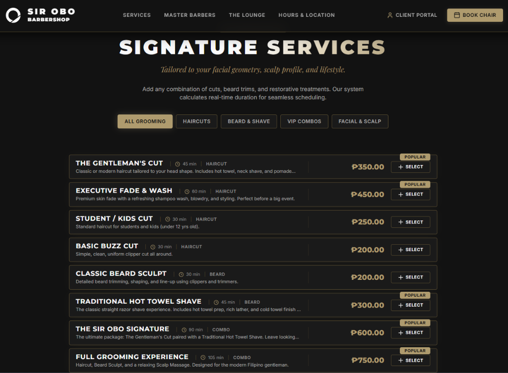
Based on the UI design principles I learned from the course, here are the main problems with this service screen:
- Too Many Choices at Once: Showing eight dense items stacked vertically makes the screen feel crowded and overwhelms the user.
- Poor Information Grouping: The service details, prices, and descriptions run together without enough separation, making it hard to read quickly.
- Overused Popular Badges: Too many items are tagged as popular, which makes the badge lose its meaning and confuses the user instead of helping them choose.
- Cramped Layout and Spacing: There is not enough breathing room between text, prices, and buttons, causing everything to fight for attention.
02. Applied Solutions
How will you improve it based on what you learned?
To fix these issues using what I learned about chunking, visual hierarchy, and space, I will make the following changes:
- Group Information Properly: Break the services down using better spacing and cleaner sections so the text is easy to digest.
- Use Fewer Badges: Limit the popular tag to just one or two real flagship services so it actually helps guide the user's choice.
- Add Negative Space: Give each card more breathing room so the titles, prices, and select buttons stand out clearly without crowding each other.
- Reduce Mental Overload: Keep the design clean and simple so users can scan options comfortably without feeling stressed or rushed.
URL COPIED